Leading the design efforts for the Search and Finding teams, I played an integral role in the end-to-end product lifecycle. Joining the project midway, my primary focus shifted towards delivering solutions and defining the product’s visual brand identity.
This project posed several complexities, notably in stakeholder alignment. We were tasked with a core aspect of the user experience, introducing new brand guidelines for the first time. This required a deep dive into art direction.
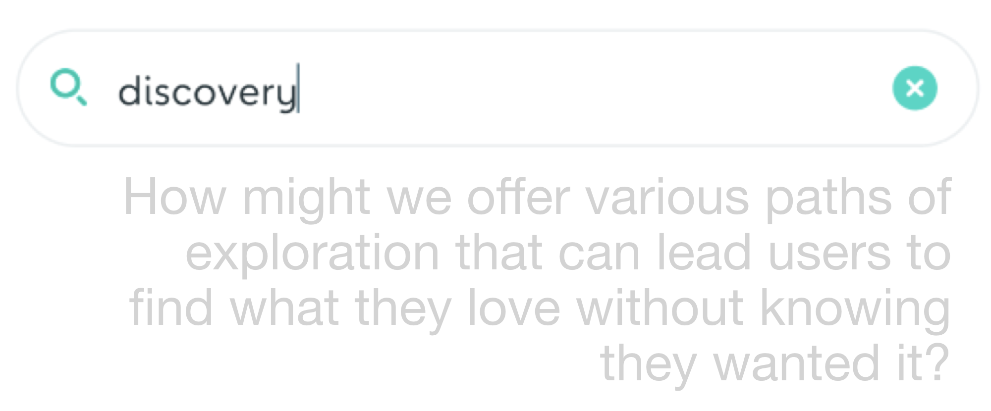
Within Wallapop, we encounter diverse user behaviors—searching, browsing within sections, and exploring aimlessly. While our focus was on enhancing the search experience, we couldn’t ignore the others.
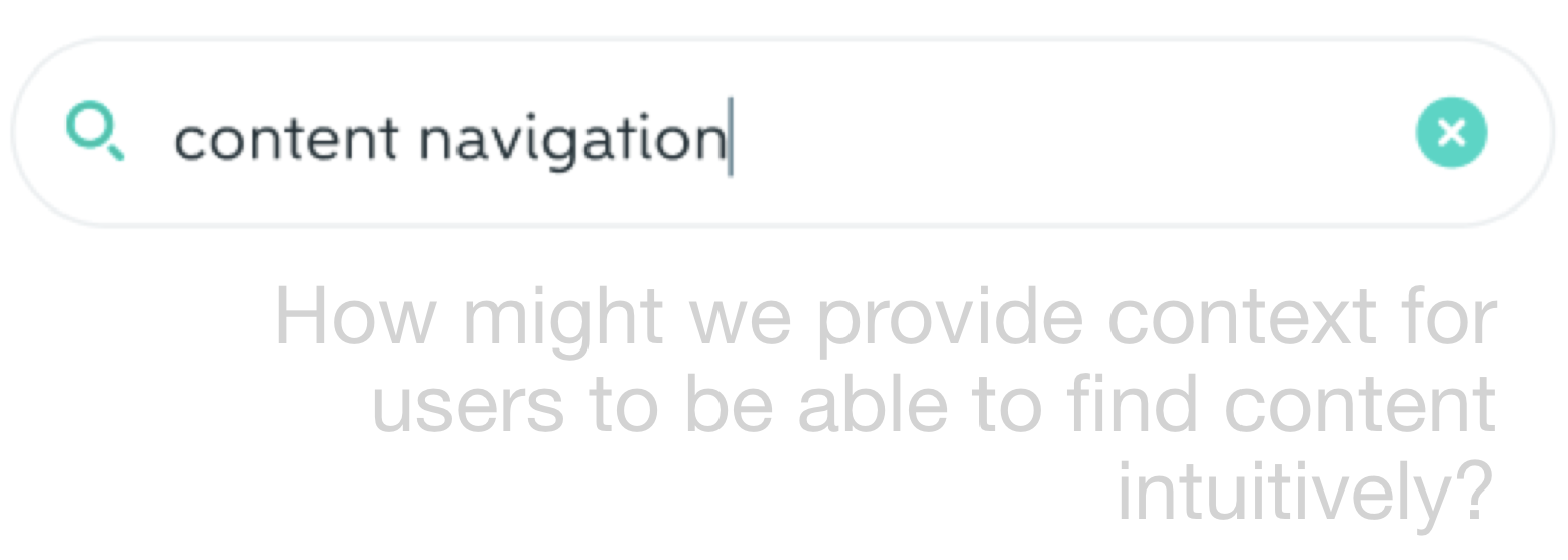
Users craved better catalog categorization, as the existing system fell short. Subcategories, often associated with established retail and e-commerce platforms, became essential for efficient navigation, akin to wayfinding in a physical store.
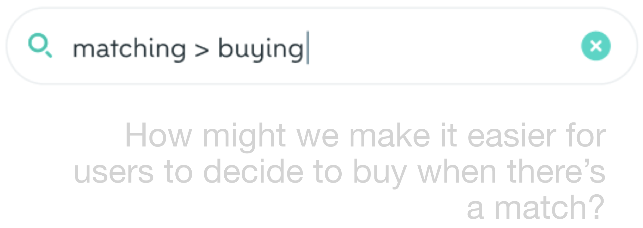
Users also desired guidance, relying on our expertise to steer them in the right direction. This extended to categorization during uploads and suggestions within the search process.
Taxonomy emerged as the solution for structuring content. With its formal, hierarchical framework, it fulfilled fundamental information architecture needs, making content findable, accessible, and clear. To validate this approach, I conducted usability testing with 10 users, who expressed satisfaction with structured content guiding their Wallapop experience.
Defining success
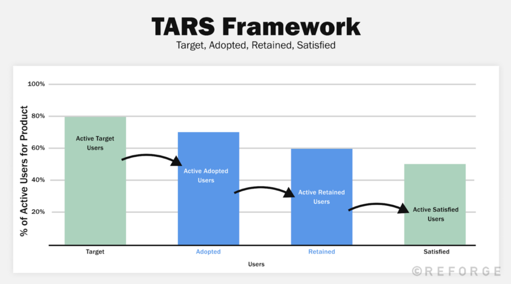
Our success criteria were clear: increase findability, measured through user retention—specifically, the percentage of users continuing to use taxonomies for navigation.
Addressing complexity: New brand guidelines
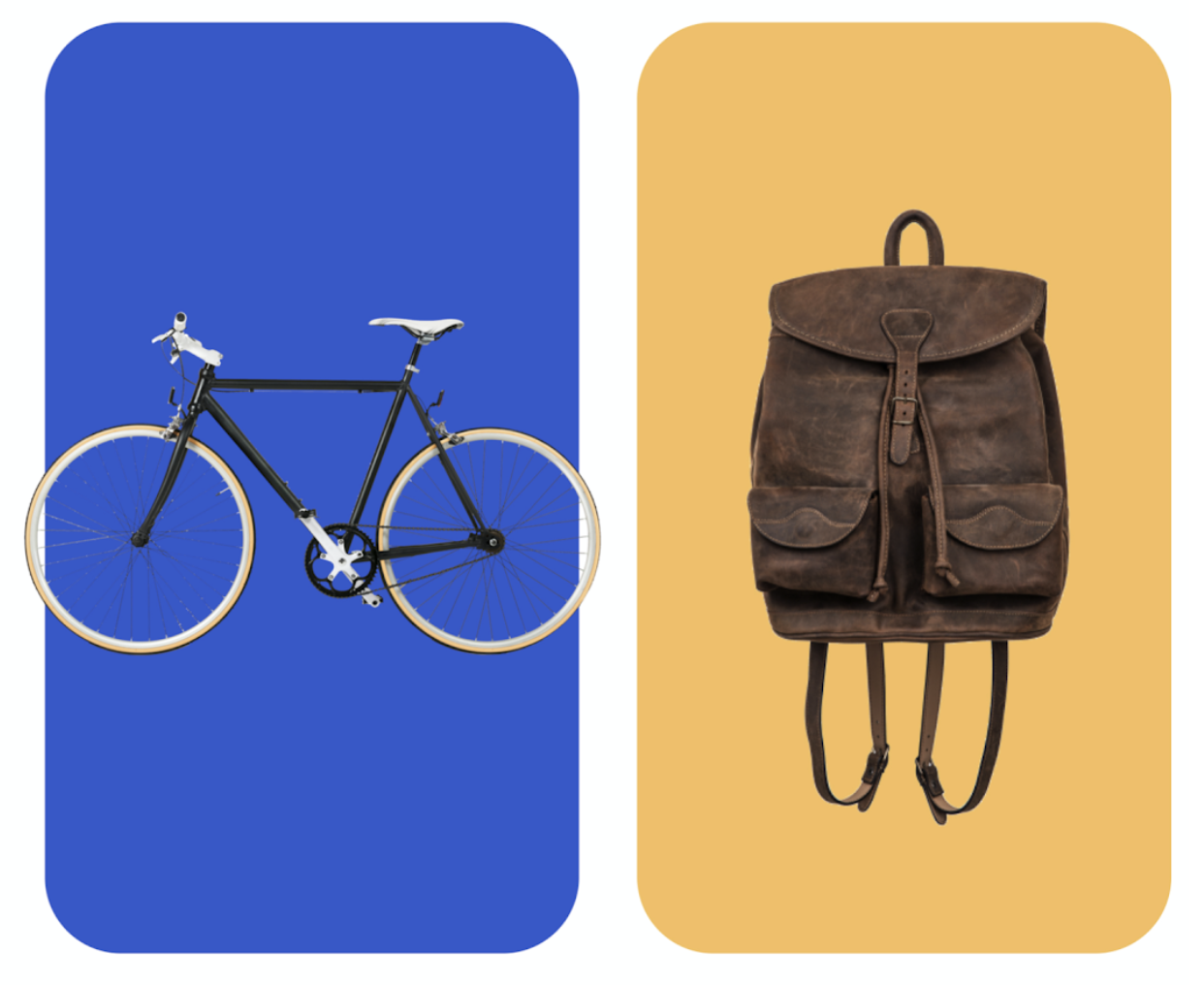
This project marked the introduction of a new brand book into the product. It involved workshops and collaboration with an external agency to adapt the brand rules to the product seamlessly.
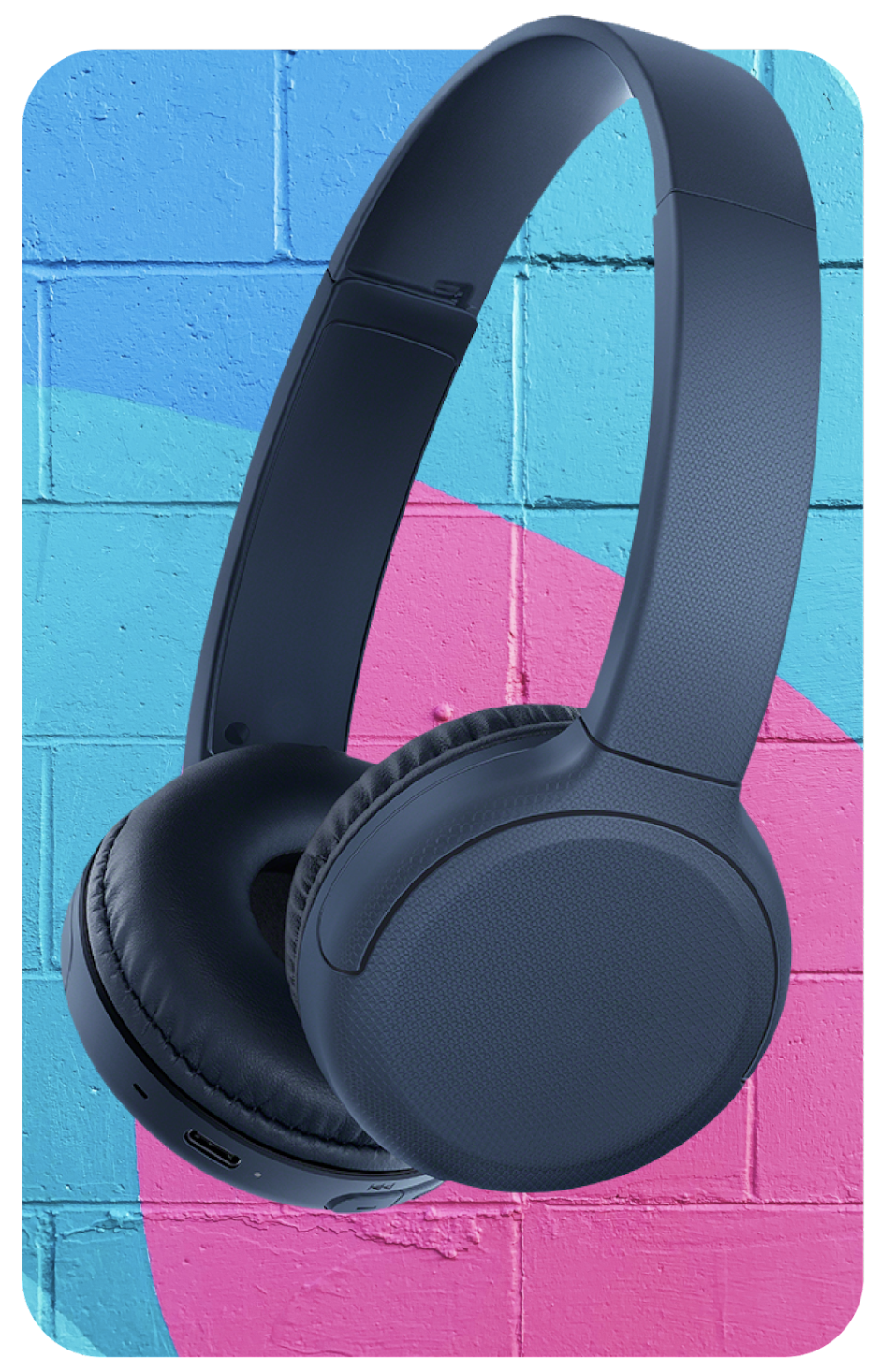


In the realm of product design, I strived to align visual elements with the brand’s communication. This led to the exploration of different product presentation styles, including solid colors and images as backgrounds.
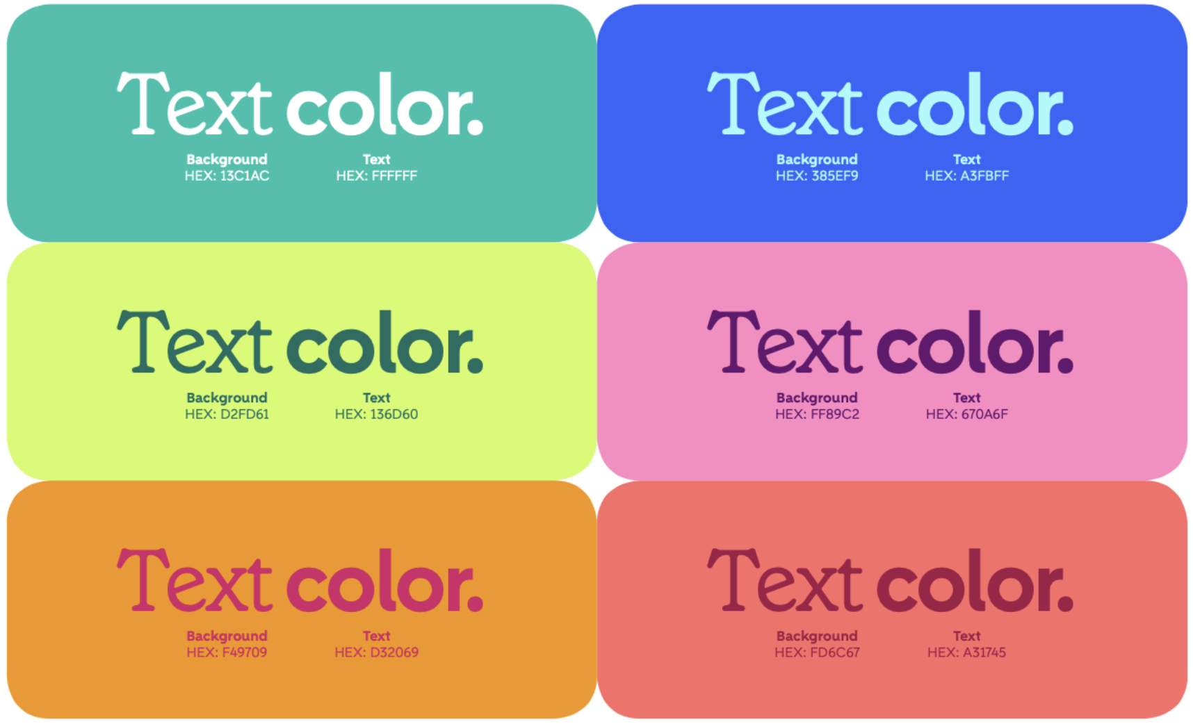
Attention to detail extended to accessibility. I ensured the new color palette met accessibility standards, conducting contrast checks and developing compliant color pairings.
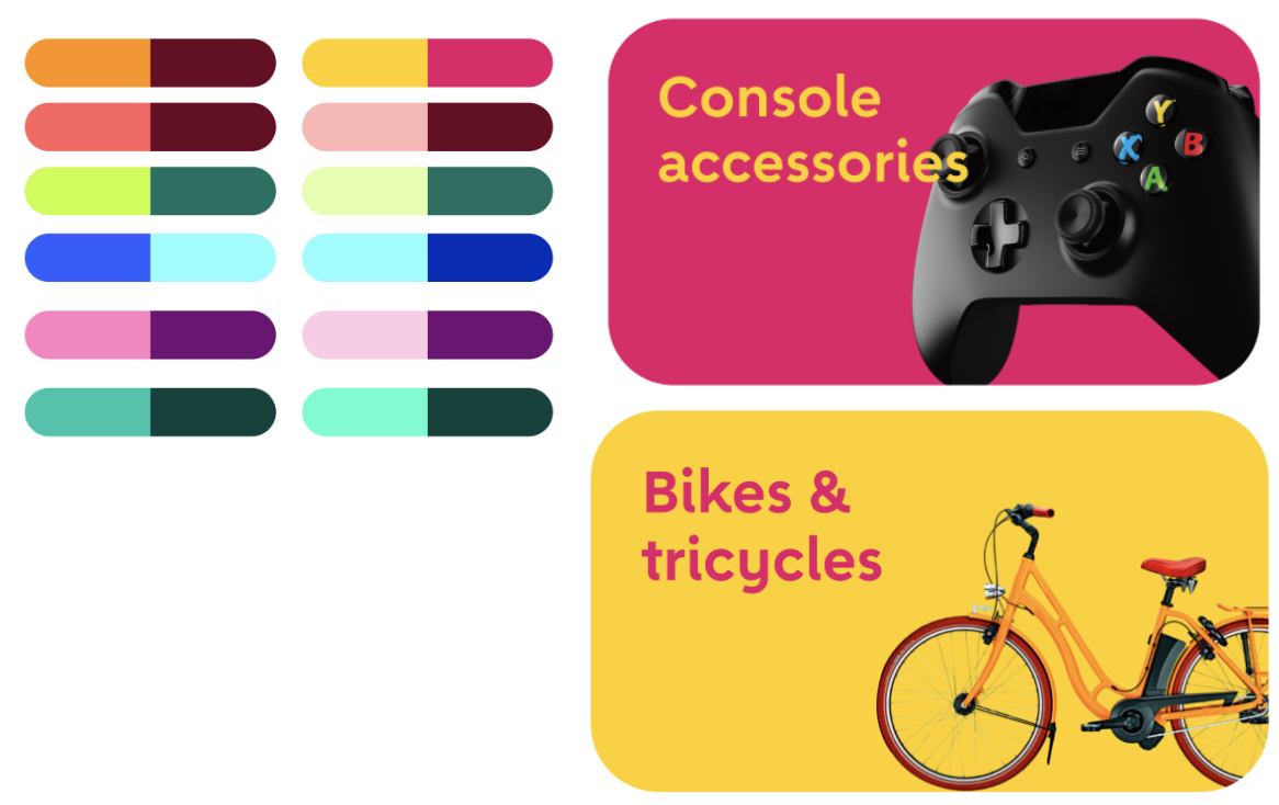
The new ecosystem introduced innovative ways to engage users, fostering community-building, lowering customer acquisition costs, and increasing customer lifetime value.
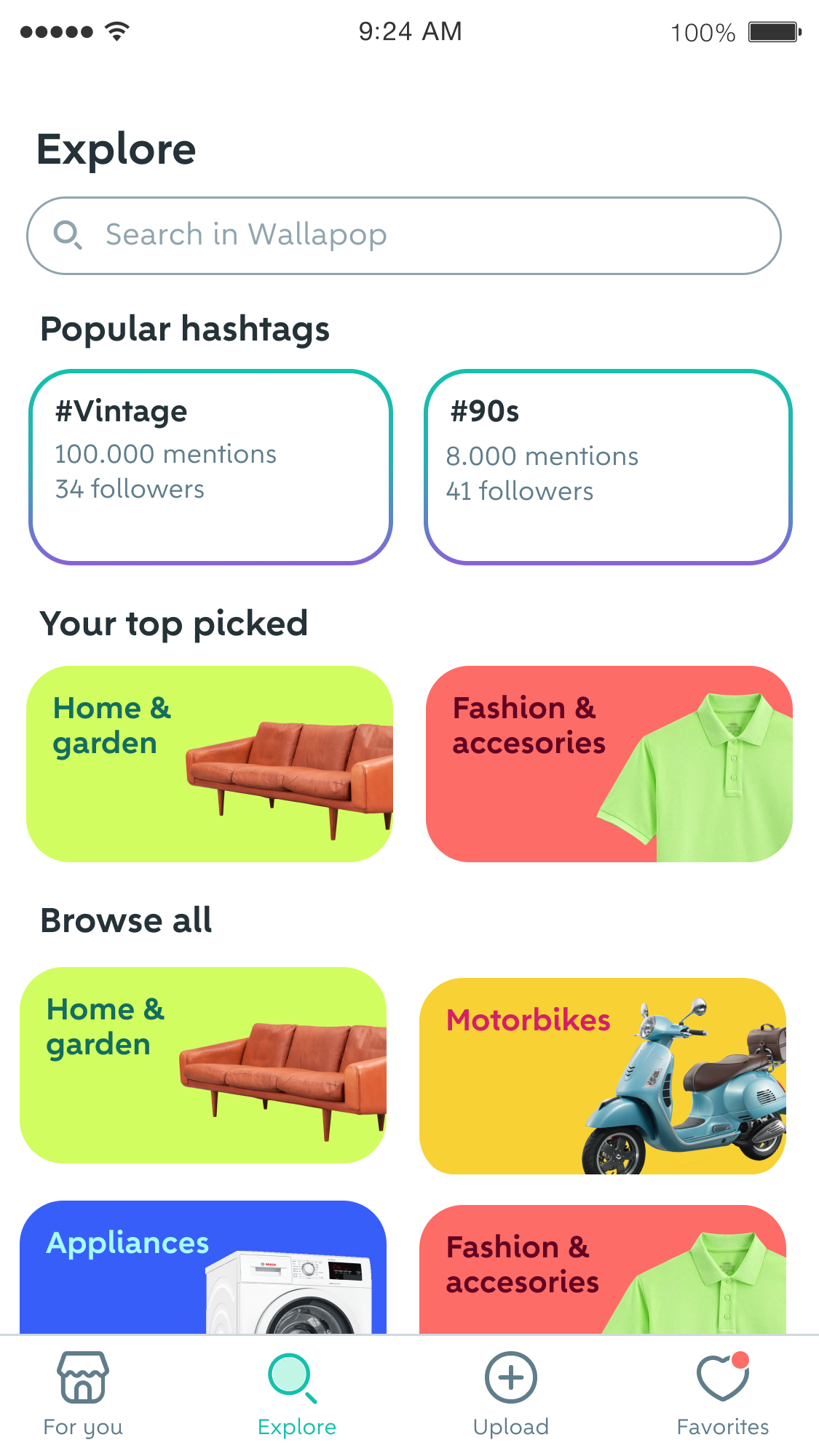
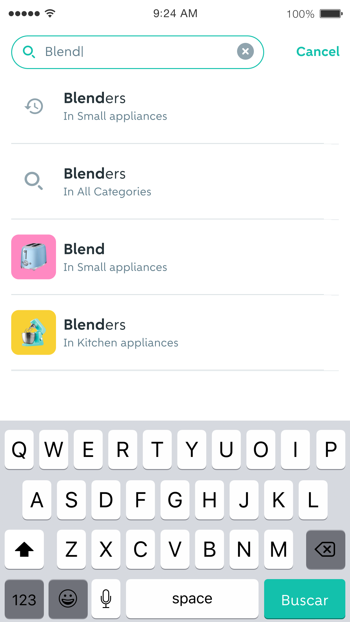
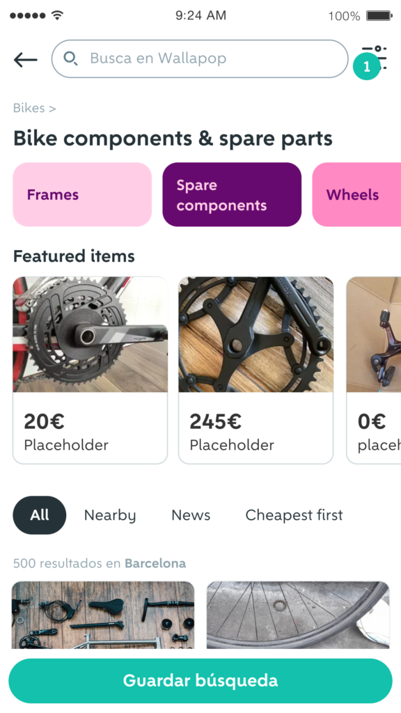
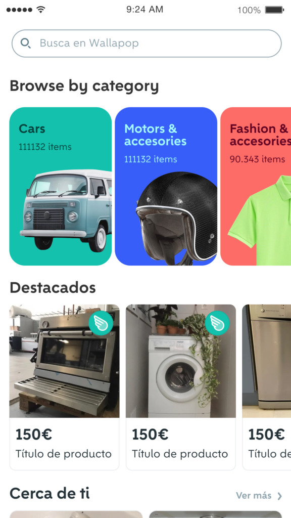
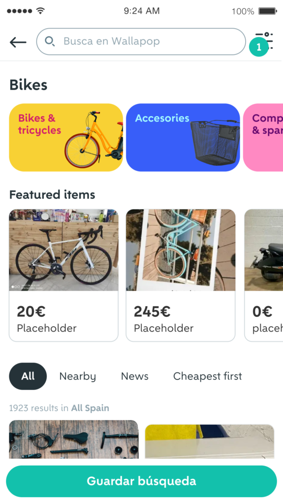
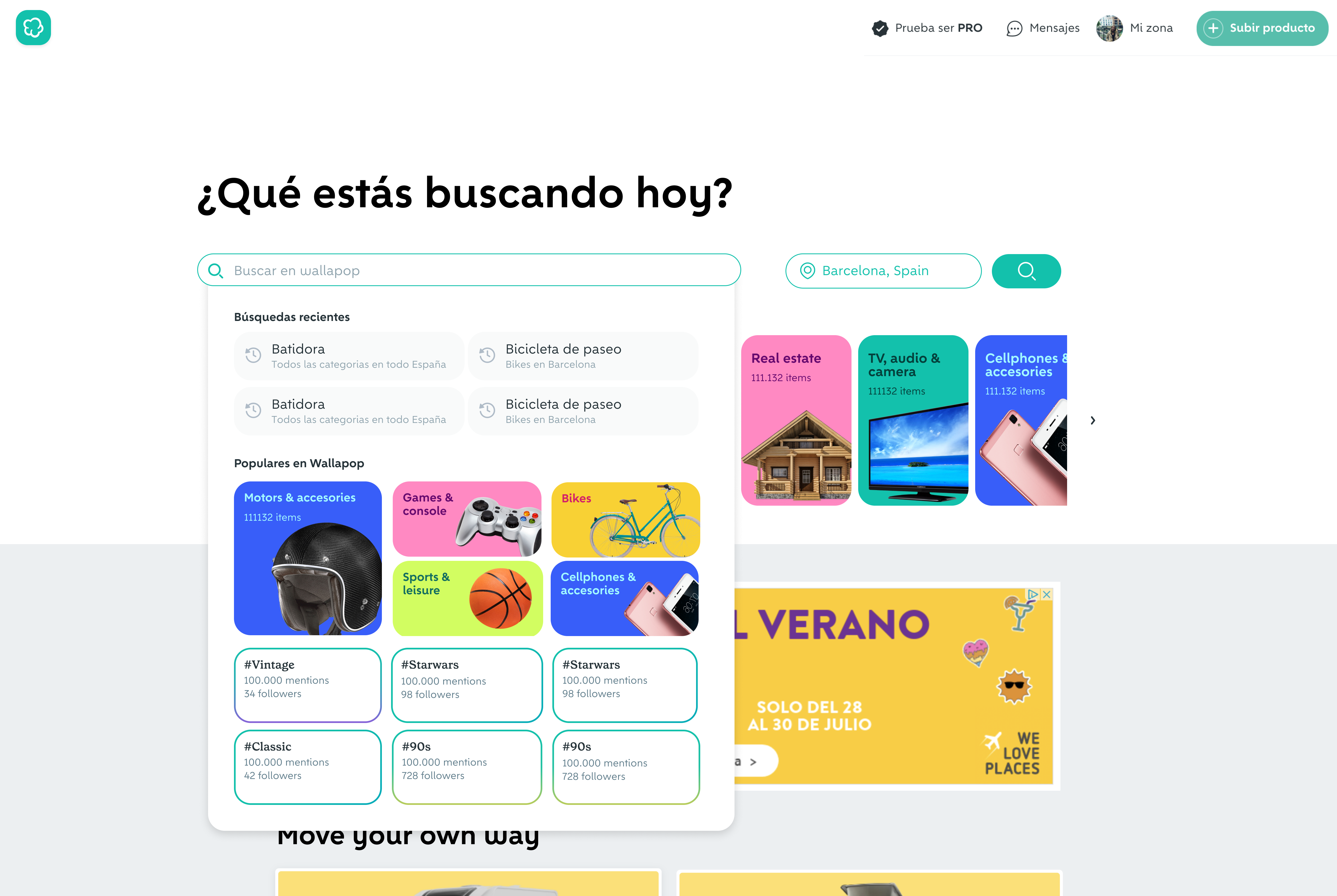
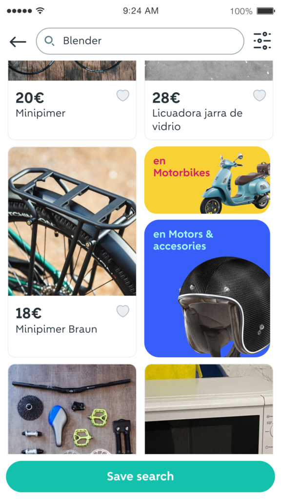
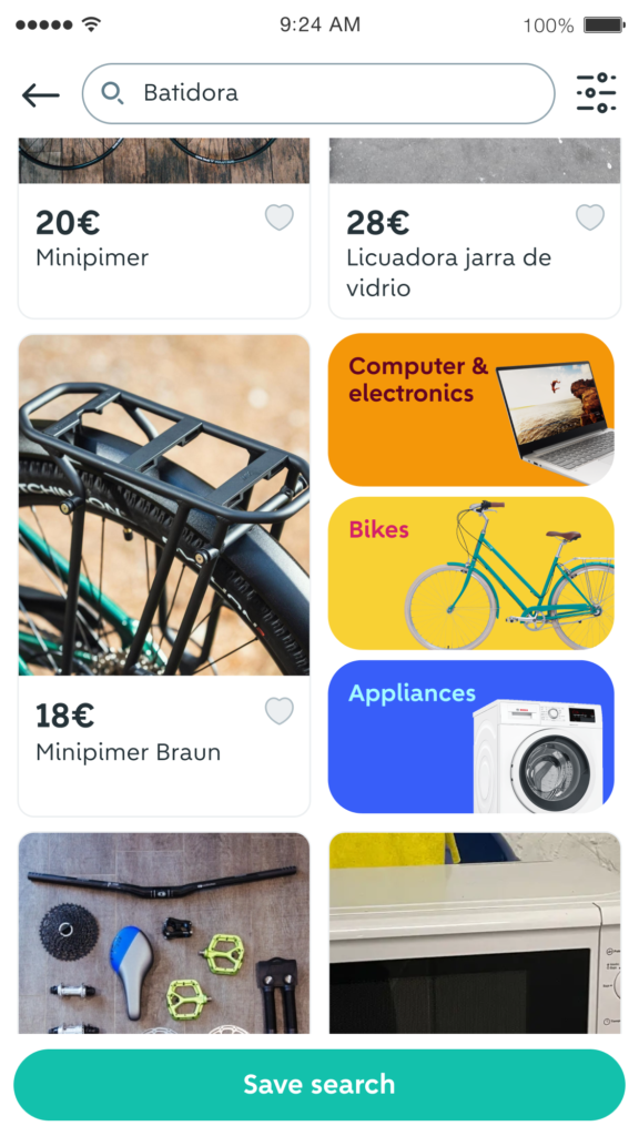
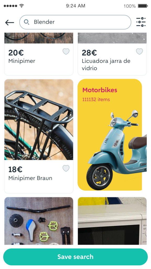
A less visible but crucial aspect of the project was componentization. This involved meticulous image selection for over 100 categories, overseen by a freelancer under my guidance. I developed a versatile system to accommodate a wide variety of categories, including creating and documenting components in Figma and Gitbook and collaborating with the Design System and Design Teams.
In summary, my role in this project encompassed design leadership, brand integration, component development, and image selection, all while addressing user needs for enhanced navigation and guidance within the Wallapop platform.
